 Ruwaza
Mobile-first isn't a trend. It's where your customers already are.
Most visitors will meet your business on a phone, often on a slow connection. Six habits that make sites and apps feel fast and easy on any device.
By Laurence Juma · · 4 min read
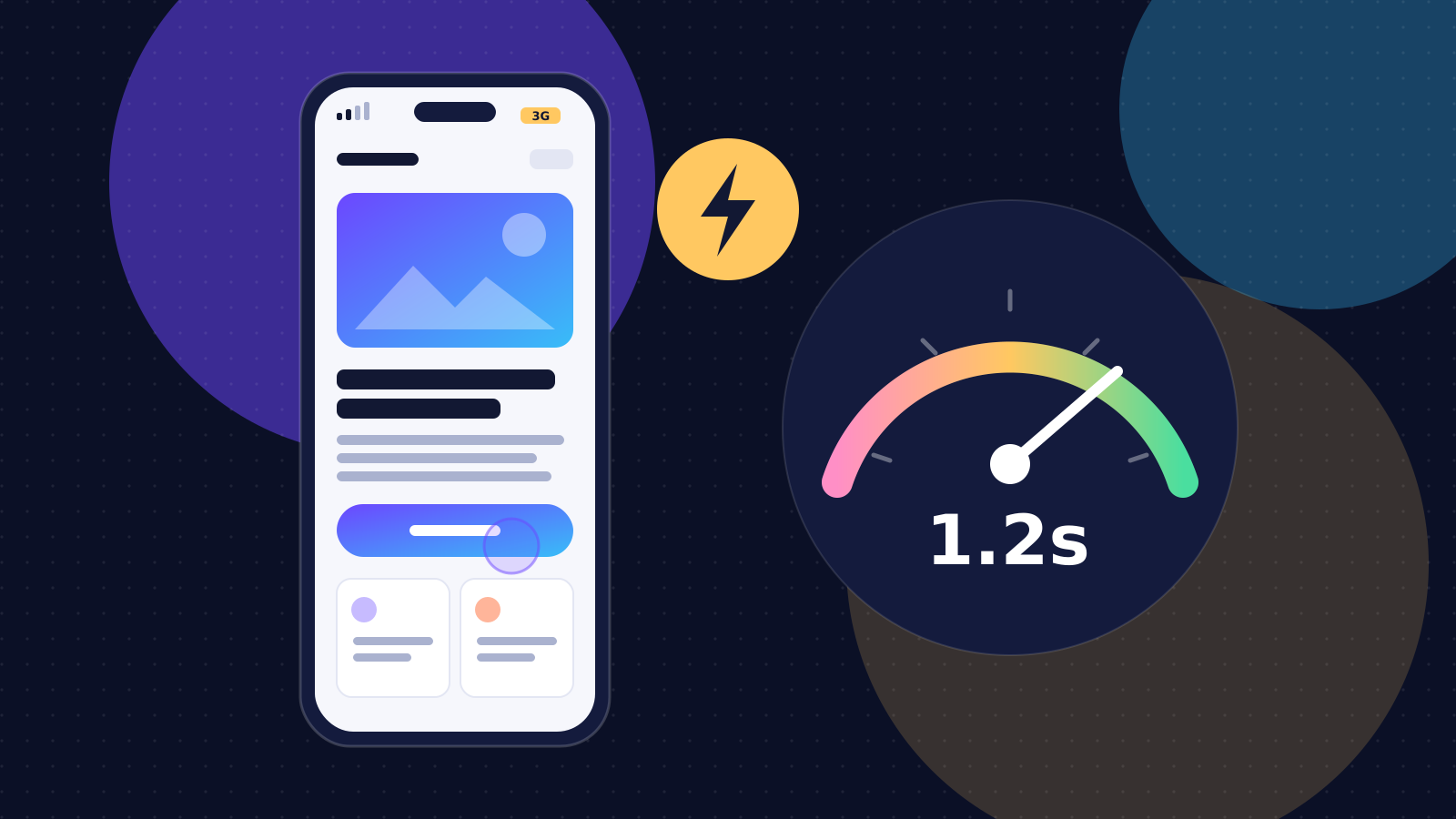
For most Kenyan businesses, the large majority of website visitors arrive on a phone, often a mid-range Android device on mobile data, sometimes on a patchy connection. If your site is designed on a large monitor first and squeezed down later, those visitors get the worst version of your business: slow pages, tiny buttons and forms that fight back.
Mobile-first means designing for the phone first and then adapting upwards to tablets and desktops. It is not a trend or a design style. It is simply designing for where your customers already are. Here are six habits that make websites and apps feel fast and easy on any device.
1. Design for the thumb
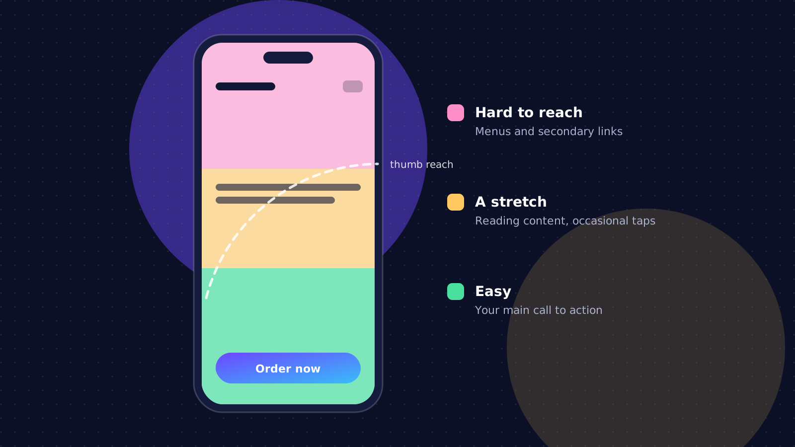
Most people hold their phone in one hand and tap with their thumb. The bottom and middle of the screen are easy to reach; the top corners are a stretch. Put your main action, such as "Order now", "Book" or "Chat on WhatsApp", where the thumb already is.
- Make every tap target at least 44 to 48 pixels high, with space between neighbouring links so people don't hit the wrong one.
- Never rely on hover. There is no hover on a touch screen, so anything hidden behind it is invisible.
- Keep the most important action visible without scrolling on the first screen.
2. Treat speed as a feature
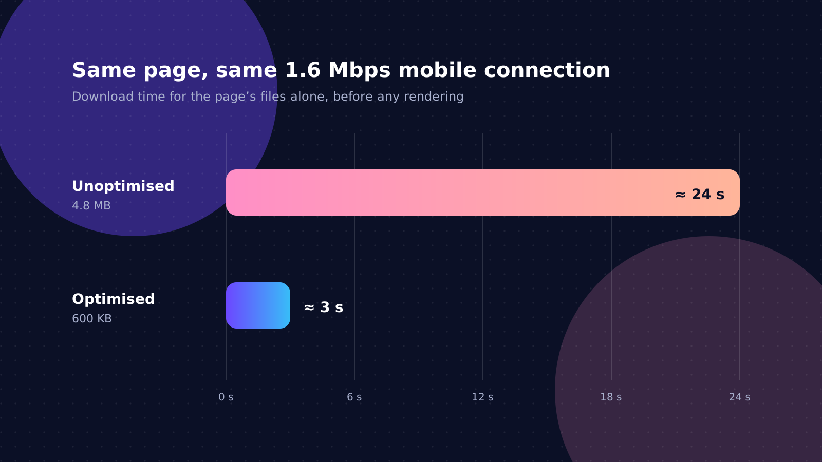
Every extra second of loading loses visitors, and on mobile data every megabyte also costs your customer money. Google measures this too: its Core Web Vitals consider a page good when the main content appears within 2.5 seconds, the page responds to taps within 200 milliseconds and the layout doesn't jump around while loading.
- Resize and compress images and serve modern formats such as WebP or AVIF. Images are usually the heaviest part of a page.
- Ship less JavaScript. Every script must be downloaded, read and run by the phone's processor, which is far slower than a laptop's.
- Pre-render pages so text and layout appear before scripts finish loading.
- Lazy-load what is below the fold, so the first screen arrives first.
- Test on a real, inexpensive phone on mobile data, not only in a desktop browser on fast Wi-Fi.
3. Write for small screens
Mobile readers scan before they read. Give them something to scan: short paragraphs, clear headings that say what each section is about, and one idea per section. Lead with what the visitor most needs to know, such as what you do, where you are and how to reach you, rather than with a long welcome message.
Use a readable text size (at least 16 pixels for body text) and strong contrast. Bright sunlight on a phone screen is far less forgiving than an office monitor.
4. Make forms forgiving
- Ask only for what you truly need. Every extra field loses some people.
- Use the right keyboard for each field: numbers for phone numbers, the email keyboard for email addresses.
- Accept the way people actually type, such as phone numbers with spaces, or starting with 07 or +254, and tidy them up yourself.
- Keep what people typed if something fails, and explain each error next to the field it belongs to, in plain words.
- Let browsers autofill names, emails and addresses by labelling fields properly.
5. Plan for patchy connections
Connections drop in lifts, on matatus and in rural areas. Design for it: show progress while something loads, save drafts of long forms, and let people retry without starting again. For apps used in the field, such as surveys, deliveries or inspections, work offline and sync when the connection returns, so nobody loses a day's work to a weak signal.
6. Make it accessible
Accessibility and mobile-first go together. Proper labels help screen readers and autofill alike; good contrast helps people with low vision and anyone in bright sunlight; large tap targets help people with limited dexterity and everyone on a bumpy ride. Building to accessibility standards from the start costs little and widens your audience.
A quick check you can do today
Open your website on an ordinary phone, switch off Wi-Fi and try to do the one thing you most want visitors to do: call, enquire, book or buy. Time it. Note every moment you had to zoom, wait or retype something. That list is your mobile-first plan.
Build for the hardest conditions and everyone benefits: the site is faster, clearer and easier to use on every device, and it ranks better too.